Introduction
This page was written beause of a query by nicod in the API user-supported group
nicod wanted to know how to produce the chart below.
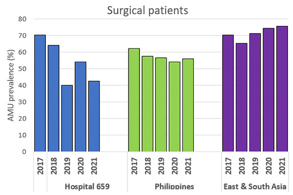
What nicod wants the Google Chart to look like
I have found when doing these customizations that it is best to start with a basic chart, see what that looks like with the defaults then change the parts you want. From the image nicod posted one of the hardest parts are going to be getting the groups to be all the same color, especially as I am using a spreadsheet to provide the data. The problem with that is that the column roles need to be defined to provide the colors.
Another thing that may prove troublesome is having the double row of x-axis labels along the bottom of the chart.
The Charts
The data for the following charts comes from a Google Sheet
The Default Chart
The default chart
Grouping the data is done by default
The code for the above chart is:
<script type="text/javascript">
      // Load Charts and corechart packages.
      google.charts.load('current', {'packages':['corechart']});

      // Draw the chart when the API is loaded.
      google.charts.setOnLoadCallback(nicodChart);

      function nicodChart() {

var queryString = encodeURIComponent('SELECT *');
   var query = new google.visualization.Query('https://docs.google.com/spreadsheets/d/1tswaWUAbeBijHq4o505w0h7TmbD-qGhR3jBactcbGq0/gviz/tq?gid=1457844859&headers=1&tq=' + queryString);
   query.send(handleQueryResponse);
}

function handleQueryResponse(response) {
   if (response.isError()) {
   alert('Error in query: ' + response.getMessage() + ' ' + response.getDetailedMessage());
   return;
}

var nicodData = response.getDataTable();

var nicodChart = new google.visualization.ColumnChart(document.getElementById('nicodV1Div'));
nicodChart.draw(nicodData);
}
</script>
Adding Basic Options
Some options are fairly basic such as adding labels and the height of the chart. The chart title always appears to be near the left of the chart. There doesn't appear to be a way of positioning it, "Surgical Patients", in the chart, so in the following example it was centered using CSS before the div that holds the chart.
Surgical Patients
The code for the above chart is:
<script type="text/javascript">
google.charts.load('current', {'packages':['corechart']});
google.charts.setOnLoadCallback(drawURLViz);
function drawURLViz() {
   var queryString = encodeURIComponent('SELECT A,B,C ORDER BY A LIMIT 5');
   var query = new google.visualization.Query('https://docs.google.com/spreadsheets/d/1tswaWUAbeBijHq4o505w0h7TmbD-qGhR3jBactcbGq0/gviz/tq?gid=0&headers=1&tq=' + queryString);
   query.send(handleQueryResponse);
}

function handleQueryResponse(response) {
   if (response.isError()) {
   alert('Error in query: ' + response.getMessage() + ' ' + response.getDetailedMessage());
   return;
}

var URLData = response.getDataTable();
var URLView = new google.visualization.DataView(URLData);
URLView.setColumns([0, 1]);
var URLChart = new google.visualization.BarChart(document.getElementById('URL-chart'));

URLChart.draw(URLView);
// Add the event handler and processing
google.visualization.events.addListener(URLChart, 'select', URLHandler);
function URLHandler(e) {
   var selection = URLChart.getSelection();
   var URLPizza=URLData.getFormattedValue(selection[0].row,2);
   window.open(URLPizza,'_blank');
}
}
</script>
This page created April 24, 2022; last modified April 24, 2022