Well, can you?
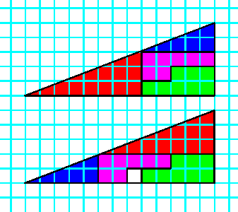
This isn't really an optical illusion but it is an interesting problem.
Although the large triangles are made up of the same smaller triangles,
why is there a space left over in the lower one?
It's because that although the hypotenuse of the large composite triangle looks as if it's a straight line, it's not.
From my school days and SOH CAH TOA (Sine = Opposite / Hypotenuse, Cosine = Adjacent / Hypotenuse and Tan = Opposite / Adjacent), we find
that for the smaller blue triangle the bottom angle is 21.8, whilst for the bigger red triangle it is 20.56, This small difference (1.24
degrees) is enough so that in the first composite triangle the "hypotenuse" is actually concave and in the second convex,
giving the extra unit of space.
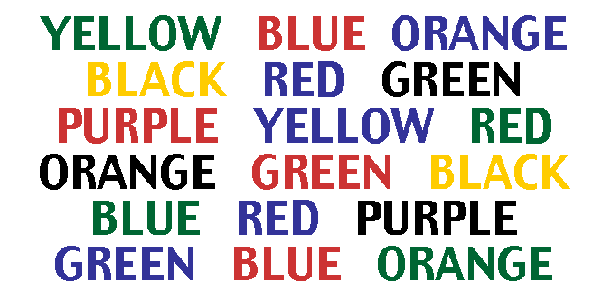
Try saying the colour you're seeing not the word
What's happening is that the right hand side of your brain is trying to say the colour,
but the left hand side insists on reading the words
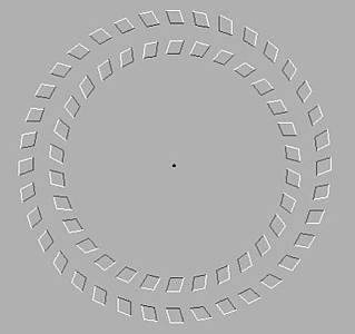
Focus on the dot in the centre of this picture, then move your head backwards and forwards
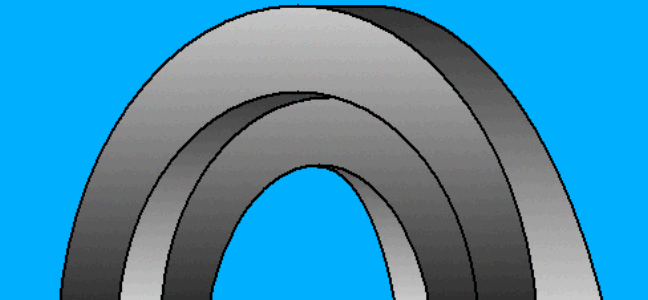
Is the inner arch parallel or perpendicular to the outer?
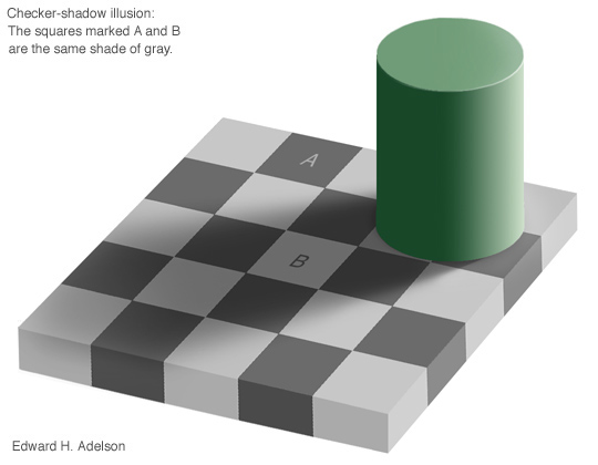
Believe it or not, the squares marked A and B are the same colour
An explanation of how this illusion works
Many thanks to Professor Adelson of the Perpceptual Science Group and the Department of Brain and Cognitive Sciences of MIT for allowing me to use his image
Professor Adelson's paper Lightness Perception and Lightness Illusions and demonstrations
This fantastic portico doesn't really exist!
It was painted by Richard Haas on the facade of the Brotherhood building in Cincinnati, Ohio in 1983
It's an example of trompe l'oeil ("to deceive the eye") or faux finishes
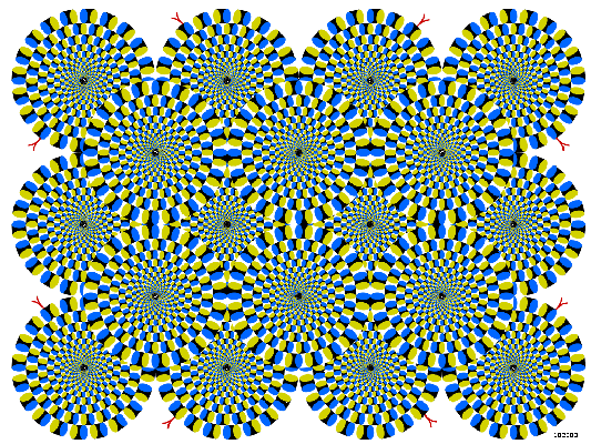
Keep Still!
These circles just don't want to keep still
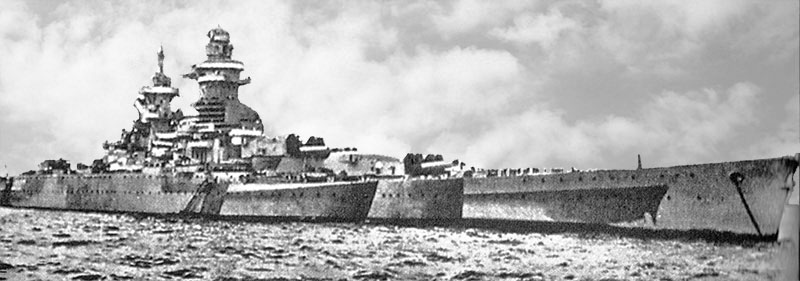
Clever Camouflage
This is really one battleship painted to look like three or four. The image was taken from an illustration in the Discovery Box Optical Illusions package, published by Scholastic in 1996, ISBN 0-590-89667-9. No credits were given for this photograph.
In May 2005, I received an email from Francois Levrat in Paris who says that it's the French ship "Richelieu" during the second world war. This clever camouflage is not an attempt to hide the ship but rather to confuse an enemy as to its range, speed, and heading.
Another type of camouflage with the same goal was dazzle camouflage.
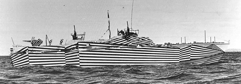
Dazzle Camouflage - PT170 during WWII
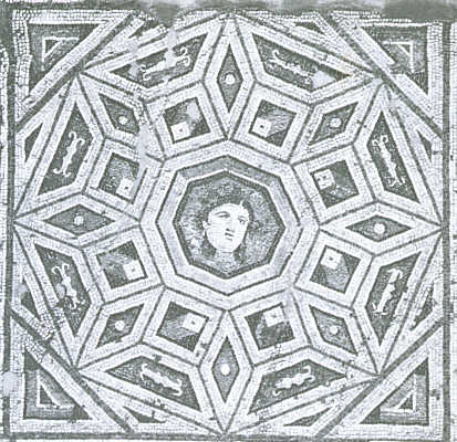
Mosaic from the house of Menander at Antioch
Third century AD
This image was taken from "Optical Illusions and the Visual Arts" by Ronald G. Carraher and Jacqueline B. Thurston.
Reinhold Book Corporation, New York. 1966
Look at the trapezoids around the border, which of them seem to be raised and which are sunken?
Perhaps the image below will make things clearer?


Color Concentrate Corporation logo
This logo was designed by Malcolm Grear
This image was taken from "Optical Illusions and the Visual Arts" by Ronald G. Carraher and Jacqueline B. Thurston.
Reinhold Book Corporation, New York. 1966
The logo looks as if it was based on the Kanizsa figures

Although it doesn't look like it, the distance between points A and B is the same as the distance between points B and C.

Which of the thin lines is longer? Sure?
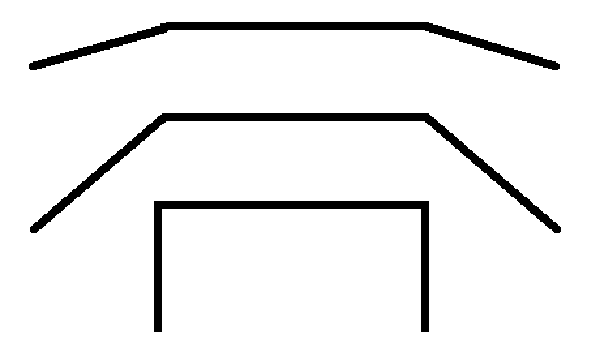
Are the horizontal lines the same length? Or not?