Introduction
This page looks at the methods that can be used to add multiple data sets to a Google Chart graph that have wide-ranging data points.
Here is an example of what I mean:

Graph from Google Search Console
Google Search Console keeps the daily data from the last sixteen months but I want to show the monthly statistics for this site going back to November 2019 that I have.
The Data
The data is, as with most of my charts, in a Google Sheet and is vertically aligned. Using the Sheets aggregate function these are the data ranges I want to show:
| Data Set | Min | Max | Average |
| Clicks | 563 | 1,820 | 1,183 |
| Impressions | 16,400 | 84,400 | 56,684 |
| CTR | 1.47 | 3.79 | 2.18 |
| Position | 18.20 | 22.90 | 20.54 |
The problem is to show the data ranging from 1 to 85,000, and the graphs still look readable. The data is being stored in columns in a Google Sheet and looks like this:.
| Month / Year | Impressions | Clicks | CTR | Position |
| Jun 2024 | 80,500 | 1,440 | 1.79 | 21.0 |
| Jul 2024 | 76,500 | 1370 | 1.79 | 21.1 |
| Aug 2024 | 84,400 | 1500 | 1.78 | 20.4 |
The month / year column was formatted as a month / year date. but had to be changed to plain text after the first test. Impressions, Clicks and Position come from the monthly Google Search Console page for my site and are recorded with varying degrees of decimal precision. The CTR (clickthrough rate) is a calculated column using (Cicks / Impressions) * 100. Another valid formula for this is (Clicks * 100) / Impressions. I did the calculation in the Sheet, but it could just as easily be done in the chart JavaScript.
The Test Charts
The charts here were drawn with the code at Google Charts with Google Spreadsheets, which uses this Google Sheet as a starting point. As the Sheet I am using contains no other data, the queryString was removed and the spreadsheet information changed. The original code on the page was:
var queryString = encodeURIComponent('SELECT A, H, O, Q, R, U LIMIT 5 OFFSET 8');
var query = new google.visualization.Query(
'https://docs.google.com/spreadsheets/d/1XWJLkAwch5GXAt_7zOFDcg8Wm8Xv29_8PWuuW15qmAE/gviz/tq?gid=0&headers=1&tq=' + queryString);
query.send(handleQueryResponse);
This was changed to:
var query = new google.visualization.Query('https://docs.google.com/spreadsheets/d/1EgTfLai1DwKcGN-3Q7uOwIL7ezKWmU05lnpHeOVVQAQ/gviz/tq?gid=1225594337&headers=1');
query.send(handleQueryResponse);
Test Chart 1

Multidata test chart 1
This was not what I was expecting at all!
Test Chart 2
The date was entered into the spreadsheet as month/day/year e.g. 9/1/2024, then formatted to mmm yyyy e.g Sep 2004. I changed the formatting in the Sheet to "Plain text", and produced this graph, which is more what I expected.
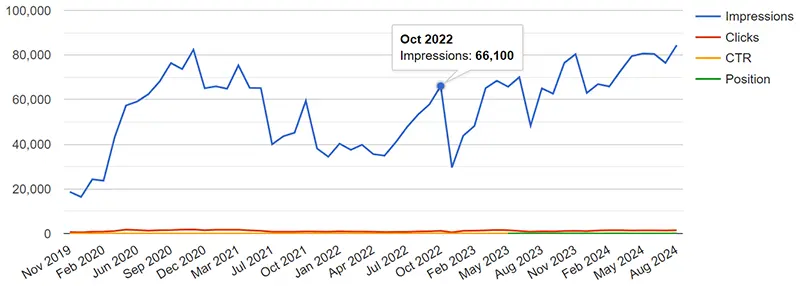
Multidata test chart 2
Changing the formatting in the Sheet to plain text now means the date column is treated as discreet data and not continuous. This may have implications as to what I can do with the chart later.
Test Chart 3
Using a multiplier
To make the clicks, CTR and Position lines clearer I added a multiplier to the Sheet columns. The number of clicks was multipled by 30, the CTR by 5,000 and the position by 1000.
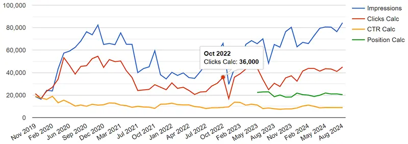
Multidata test chart 3 - Adding a multiplier
This makes the chart much clearer but the tooltips are totally inaccurate. In the above example, the number of clicks for October 2022 should be 1,200 not 36,000 (1,200 x 30).
Test Chart 4
Changing the cell value and formatted values
Each cell of the data table can contain two types of data, a value and a formatted value. The data table cells' value are set from the Sheet when the data is imported. The graph lines are drawn using the cell formatted values and the tool tips from the values. The following JavaScript nested loops step through the data table's rows and cloums, copying the cell's value to the formatted value then applies the multipliers, number of clicks multipled by 30, the CTR by 5,000 and the position by 1000 and writes the result back to the cell's actual value.
var totalRows = GSCDataTable.getNumberOfRows();
var totalCols = GSCDataTable.getNumberOfColumns();
for (i = 0; i < totalRows; i++) {
	// Don't need to process columns 0 and 1 (A and B)
	for (j = 2; j < totalCols; j++) {
		var cellValue = GSCDataTable.getValue(i,j);
		GSCDataTable.setFormattedValue(i,j,cellValue);
		if (j==2) { GSCDataTable.setValue(i,j,cellValue * 30); }
		if (j==3) {
			GSCDataTable.setFormattedValue(i,j,cellValue.toFixed(2));
			GSCDataTable.setValue(i,j,(cellValue * 5000).toFixed(2));
		}
		if (j==4 && cellValue > 0) { GSCDataTable.setValue(i,j,cellValue * 1000); }
	}
}
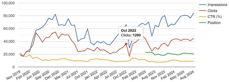
Multidata test chart 4 - Cell values and cell formatted values processed
Test Chart 5
Cosmetic changes - chart options
The vertical scale no longer makes any sense and can be hidden in the chart options by using vAxis: {textPosition: 'none'}
The legend (key) can be put on top of the chart by using legend: { position: 'top', maxLines: 3}
The space taken up by the chart can be adjusted in the chart area and I have used chartArea: {top:20, left:'6%', height:'80%', width:'96%'}
The cursor can be changed to crosshairs. I have used crosshair: {trigger: 'focus', orientation: 'vertical', color: 'black'}
The options for the chart are now:
var GSCOptions = {
	chartArea: {top:20, left:'6%', height:'80%', width:'96%'},
	width: "100%",
	height: 400,
	vAxis: {textPosition: 'none'},
	legend: {position: 'top', maxLines: 3},
	crosshair: {trigger: 'focus', orientation: 'vertical', color: 'black'}
};
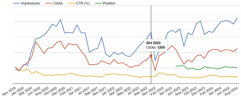
Multidata test chart 5 - Chart options
Test Chart 6
Tooltips
What I want to achieve is for every point in the chart lines in a category, which are simply the discreet points on the x-axis, to have the same tooltip that contains the information from each of them; i.e.the Month / Year, and the number of Impressions, Clicks, CTR, and Position.
When I first read the documentation of the Google Charts API at Column Roles and Tooltips, it seemed there were several changes that needed to be made:
Structure of the data table - a new column with the tooltip role had to be made to hold the tooltips
Chart options - HTML has be set to 'true' to enable the created tooltips to display properly, and the focusTarget property had to be set to 'category'.
JavaScript - A new function had to be written to create the new tooltips.
I had left this part of the code until last as I thought it be more difficult than it turned out to be. It was surprisingly easy, all I had to do was to add focusTarget: 'category' to the chart options!
The chart options are now:
var GSCOptions = {
	chartArea: {top:20, left:'6%', height:'80%', width:'96%'},
	width: "100%",
	height: 400,
	vAxis: {textPosition: 'none'},
	legend: {position: 'top', maxLines: 3},
	crosshair: {trigger: 'focus', orientation: 'vertical', color: 'black'},
	focusTarget: 'category'
};
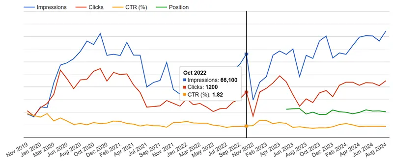
Multidata test chart 6 - Tooltips
Test Chart 7
Chart Type
The type of chart drawn is specified near the end of the code when the visualization is created. I tried various types of chart and found the lines of the column and bar charts were too thin to be properly readable. What I found worked was using an area chart.
The visualization line to do this is:
var GSCChart = new google.visualization.AreaChart(document.getElementById('GSCChartDiv'));
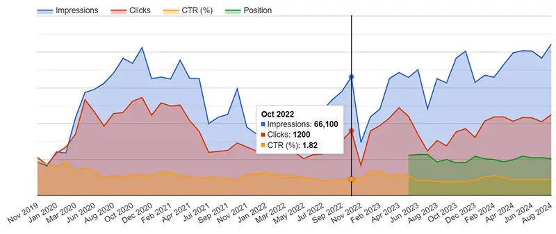
Multidata test chart 7 - Area Chart
The Finished Chart
The Code
The code for the above chart is:
<div id="GSCChartDiv"></div>

<script type="text/javascript">
    google.charts.load('current', {packages: ['corechart']});
    google.charts.setOnLoadCallback(drawGSCChart);

    function drawGSCChart() {
		var query = new google.visualization.Query('https://docs.google.com/spreadsheets/d/1EgTfLai1DwKcGN-3Q7uOwIL7ezKWmU05lnpHeOVVQAQ/gviz/tq?gid=1225594337&headers=1');
		query.send(handleQueryResponse);
    }

	function handleQueryResponse(response) {
    	if (response.isError()) {
        	alert('Error in query: ' + response.getMessage() + ' ' + response.getDetailedMessage());
        	return;
      	}

		var GSCDataTable = response.getDataTable();

		var totalRows = GSCDataTable.getNumberOfRows();
	  	var totalCols = GSCDataTable.getNumberOfColumns();

	  	for (i = 0; i < totalRows; i++) {
			// Don't need to process columns 0 and 1 (A and B)
	    	for (j = 2; j < totalCols; j++) {
				var cellValue = GSCDataTable.getValue(i,j);
				GSCDataTable.setFormattedValue(i,j,cellValue);
				if (j==2) { GSCDataTable.setValue(i,j,cellValue * 30); }
				if (j==3) {
					GSCDataTable.setFormattedValue(i,j,cellValue.toFixed(2));
					GSCDataTable.setValue(i,j,(cellValue * 5000).toFixed(2));
				}
				if (j==4 && cellValue > 0) { GSCDataTable.setValue(i,j,cellValue * 1000); }
			}
		}

		var GSCOptions = {
			chartArea: {top:20, left:'6%', height:'80%', width:'96%'},
			width: "100%",
			height: 400,
			vAxis: {textPosition: 'none'},
			legend: {position: 'top', maxLines: 3},
			crosshair: {trigger: 'focus', orientation: 'vertical', color: 'black'},
			focusTarget: 'category'
		};

      	var GSCChart = new google.visualization.LineChart(document.getElementById('GSCChartDiv'));
      	GSCChart.draw(GSCDataTable, GSCOptions);
	}
</script>
Sources and Resources
Chart Gallery - Google Charts API documentation
Column Roles - Google Charts API documentation
Crosshairs - Google Charts API documentation
Discrete vs Continuous Data Google Charts API documentation
Formatters - - Google Charts API documentation
Google Charts API Home - Google Charts API documentation
Google Charts with Google Spreadsheets - Google Charts API documentation
How to Customize Charts - Google Charts API documentation
Tooltips - Google Charts API documentation