Introduction
This page was first published in May 1999, and gone through several design changes over the years. Nearly all the changes involved changing the menu system for the entire site. This and associated pages show the menu systems I have used on the site and some ideas for new ones.
The site has always been split into sections; Bristol history, dad's navy days, optical illusions, and so on. All the menus I used list all the pages in each section and some included links to the index page to all the sctions.
May 1999 - The First Menu
When I first started writing the site I didn't realise how many pages I would eventually write. The old menu system consisted of two sets of links on each page, one for the various sections of the site and another set for each page for the section the user was actually in. This was repeated at the top and bottom of each page. This worked quite well but eventually some pages ended up being more menu than content. Not only that but every time I added a page to a section all the links in the pages in that section had to be rewritten. If I added a new section then every page on the site had to have the links changed. Most of the work was done by the excellent Ecobyte's BK ReplaceEm (Internet Archive) - which was later renamed to Replace Text. It was a multi-page, multiple line text search and replace utility. What happened then was that every changed page had to be uploaded to the servers.
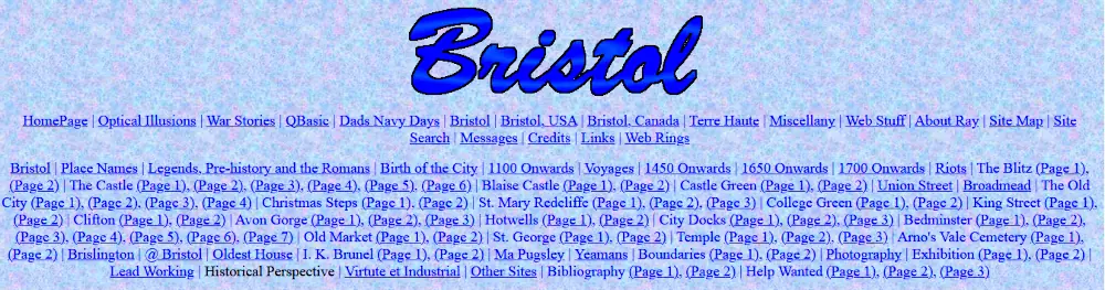
The original site menu
The menu simply consisted of a centred list of links, with a vertical bar with a space on either side separating each link. Here is a section of the menu:
<p align="center"><a href="../index.html">HomePage</a> | <a href="bind.htm"><font color="#0000FF" size="4">Bristol</a> | </font><a href="../dad/dind.htm"><font color="#0000FF" size="4">Dads Navy Days</a> | </font><a href="../optill/index.htm"><font color="#0000FF" size="4">Optical Illusions</a> | </font>...
The code is not that good, but one advantage of writing the menu this way was that the links would wrap themselves to fit whatever size the browser width was.
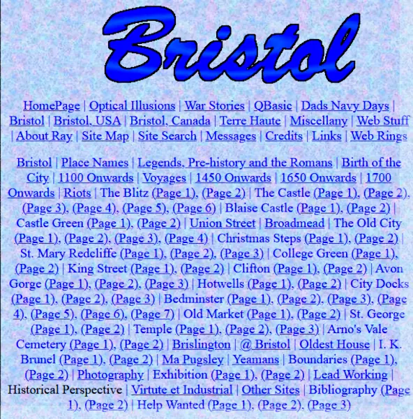
The original site menu in a narrow window width
As the site and number of pages on it grew, I started looking around for a better menu.
2003 - Self-hosting
In June 2003, I started self-hosting the site on my own server. This made adding the various menus I made to the pages very easy as I could use Apache's server side include (SSI) #include directive. This means the menus can be added to the page before it is served and I do not have to worry about trying to add them afterwards using iframes or some other mechanism.
This makes adding the menus very much easier as they can be served from a single location and I no longer have to edit every page when I need to make changes to them.
2005 - Folder Tree Menu
In June 2005, I finally got round to updating the site. I made far more use of CSS, cleaned the layout a bit and looked around for a new menu system. The menu had to consist of one page used throughout the site. Because of the number of sections and pages it should be collapsible and it should be cross-browser, cross-platform compatible. I didn't want to use frames as I want people to be able to bookmark the pages, frames make this next to impossible because the address bar always shows the frameset not the individual page. This meant that for ease of use I had to use iframes.
What I eventually came up with was based on the menus on the pages Folder Tree Menu at Benefit from IT (Internet Archive) and Unobtrusive DHTML, and the power of unordered lists at Kryogenix and the sites listed there. One major problem I had when designing the code is that Microsoft's Internet Explorer 6 did not understand the CSS code position: fixed;. A Google search found the Fixing position:fixed for Windows Internet Explorer page on the Tagsoup site (Internet Archive) and so that code was incorporated into my pages too.
Between the code offered by these sites and my own ideas, what I came up with is the menu shown in the images below:
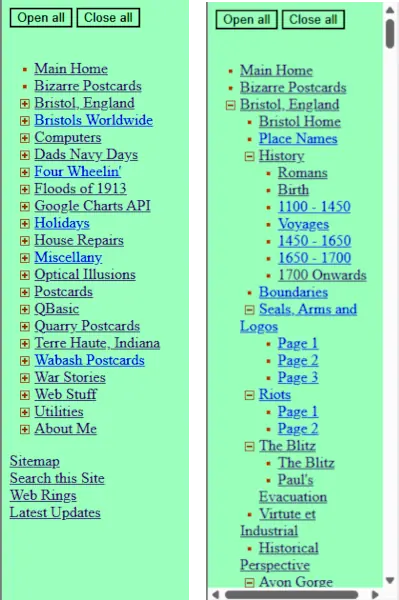
The 2005 Folder Tree menu
The Folder Tree menu is a sidebar menu and created with HTML, CSS and JavaScript. All sections of the site are listed in a nested ordered list along with a small plus sign gif to indicate that section can be opened -  . Each of the section menus can be opened individully by clicking on the link which then opens to show the section content page links. When this happens the plus sign gif is exchanged for a minus sign gif -
  - which indicates the open ordered list can be closed again.
Buttons were added to open and close all the sections at once. The width of the sidebar is fixed, and a horizontal scrollbars appears when the menu exceeds this width. A vertical scrollbar appears when the menu exceeds the page height.
Although written in 2005, the menu is still active on the site and still being updated. This is because some ofthe pages that use it have not yet been updated to use the new menus. Here is the current Folder Tree menu
2005 - Breadcrumbs
Also in 2005, I decided to add breadcrumb navigation to the site pages. These show, with links, the structure of the site from the home page to the current page the user is on. The term "breadcrumbs" comes from the Hansel and Gretel fairy tale where the children leave a trail to find their way back home.
Breadcrumb navigation seems to work best where the there are a lot of subdirectories, i.e. the structure of the site is deeper than it is wide. I later decided not to use them beccause none of the pages are like that, and are just one subdirectory away from the home page. For example, the breadcrumb trail back to the home page from this page is just "Home > Utilities > Site Menus". There are links to the all the pages in a section, the section home and the home page in the main navigation.
2014 - Single Section Sidebar
in 2014, I had another look at the menus I was using and decided to use an adapted single section sidebar. The menu consists of a simple unordered list containing links to all the pages in the web site sections alng with links to the home page, the section home page and commonly used pages such as the site updates, site map, webrings and my contact information.
The unordred list for the Utilities section of the site looks like:
<ul>
<li><a href="../">Site Home</a></li>
<li><a href="./">Site Utilities Home</a></li>
<li><a href="about.htm">About This Site</a></li>
<li><a href="accessibility.htm">Accessibility</a></li>
<li><a href="ulnkbck.htm">Back Links</a></li>
...
...
...
<li><a href="stats.htm">Statistics</a></li>
<li><a href="uimgs1.htm">Vignettes</a></li>
<li><a href="updates.htm">Latest Updates</a></li>
<li><a href="/sitemap.htm">Sitemap</a></li>
<li><a href="webrings.htm">Webrings</a></li>
<li><a href="contact.htm">Contact</a></li>
</ul>
The HTML used to add the menu to the pages is:
<div id="sidemenu">
	<!--#include file="inc/utils_menu.htm" -->
</div>
<div id="content">
	(the page contents)
</div>
THe <ul>, <li> and <a> tags are easily manipulated using styling, so the CSS for the menu is simply:
#sidemenu {
	float: left;
	color: #0B0B61;
	width: 12em;
	padding-top: 1.2em;
	margin-left: 2em;
	padding-bottom: 1.2em;
}

#sidemenu ul {
	list-style-type: none;
	padding: 0px;
	margin: 0px;
}

#sidemenu ul li {
	padding: 0.2em 0;
}

#sidemenu a {
	text-decoration:none;
	color:#0B0B61;
}

#sidemenu a:hover {
	text-decoration:underline;;
	color:#0B0B61;
}
The list is styled to show without the underlined links, which show when the mouse is hovered over them. The finished menu looks like this:
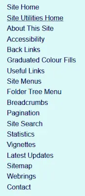
The 2014 sidebar menu
The menu is easy to make and implement. The only problem with them was a new menu had to be made for each section of the site. The good news is that because they are practiically universal in their use as menus that the same menus were used when the design was changed in 2020.
2020 - Dropdown Mwnu
In 2020, I redigned the pages to have a dropdown menu. This menu uses the hidden checkbox "hack" to work properly and uses the same unordered lists for the section menus that were written in 2014.
The HTML to draw the menu section of each page is:
<nav>
	<div id="site-home" class="menu-item"><a href="../">Site Home</a></div>
	<div id="section-home" class="menu-item"><a href="./">Utilities Home</a></div>
	<input type="checkbox" id="show-menu" role="button">
	<label for="show-menu" id="section-menu" class="menu-item"><span id="menu-down">Section Menu   ▼</span><span id="menu-up"> Section Menu   ▲</span><span id="hamburger">☰</span></label>
	<search><!--#include virtual="../common/google-search.htm" --></search>
	<div style="clear:both;"></div>
	<div id="menu-div"><!--#include virtual="inc/utilities_menu.htm" --></div>
</nav>
The CSS for the menu is:
nav {
	background-color: #006;
	width:100%;
	color: #FFF;
	font-size: 1.2em;
	padding: 1px 0;
}

.menu-item:hover, nav a:hover, #menu-div a:hover { color: #06F; }

.menu-item {
	float:left;
	padding: 0.4em 1em;
}

nav a, #menu-div a {
	text-decoration: none;
	color: #FFF;
}

#menu-div { display:none; }

#menu-div ul {
	column-count: 5;
	margin: 0;
	padding:0 2em 1em 2em;
}

#menu-div li {
	list-style-type: none;
	display:block;
}

#section-menu {cursor:pointer;}
#hamburger{padding-left:1em;}

/* Process the "section menu" elements*/
#menu-up, #hamburger, #show-menu { display:none; }
#show-menu:checked ~ #menu-div { display:block; }
#show-menu:checked ~ #section-menu #menu-down { display: none; }
#show-menu:checked ~ #section-menu #menu-up { display: inline-block; }
The menu looks like this:
The 2020 menu closed and open
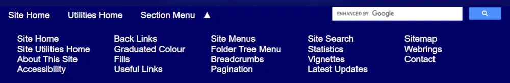
Notice that the arrow ▼ changes to ▲ when the menu is opened and closed. The number of columns in the opened menu is changed using media queries in the css files. On a ful-sized screen there are fice columns, but the queries cause it to change as the screen gets narrower.
@media screen and (max-width : 1110px) { #menu-div ul { column-count: 4; }}
@media screen and (max-width : 890px) { #menu-div ul { column-count: 3; }}
@media screen and (max-width : 680px) { #menu-div ul { column-count: 2; }}
The menu works very well but there are accessibility problems with it. The menu main section menu item is not tabbable which means it cannot be opened using the keyboard and the hidden checkbox does not traanslate well with screen readers.
2023 - Grouping Pages
In January 2023, I thought it might be an idea to group different, related, pages in a menu, even though they might not be in the same section of the site. An example of what I came up with can be found at the bottom of this page where I have listed pages from the Utilities and Web sections of the site that I have written concerning menus and their creation.
The idea behind this is that if someone visits one of the pages, they might like to read what else I have written on the subject. Grouping the pages should make it easier for the visitor to find them.
The code is not partuclarly diffuclt as it is just a couple of formatted divs, an image and some links. The code of the grouped pages at the bottom of this page is:
<div class="ctr">
<div style="display:inline-flex; padding: 2px; border: 2px solid blue; justify-content: center;">
<div style="background-color: #0b0b61; text-align: center; display:flex; align-items: center; padding: 20px;"><img style="width: 160px; height: 126px;" src="/utils/images/group-pages-web200.webp" alt="menus-menu-logo"></div>
<div style="padding: 0 14px; vertical-align:top; text-align: left">
	<p><a href="/utils/sitemenu.htm">Site Menus</a></p>
	<p><a href="/utils/treemenu.htm">Folder Tree Menu</a></p>
	<p><a href="/utils/breadcrumbs.htm">Breadcrumbs</a></p>
	<p><a href="/utils/pagination.htm">Pagination</a></p>
	<p><a href="/web/details-menu.htm"><Details> Tag Menu</a></p>
	<p><a href="/web/target-menu.htm">Target Pseudo Class Menu</a></p>
</div>
</div>
</div>