Introduction
The main object of this update is to improve the main menu system for the site pages. This main menu is based on the details tag menu, written in March 2025. The items in the main menu are now accessible and reachable using the tab key
The idea is to improve the user experience by allowing them to reach any section of the site using the same menu on every page. All the menus contain links to the Home Main, Section Main, Latest Updates, Sitemap, Webrings and Contact pages.
Column Break Points
The same as the previous menu, the menu starts with 5 columns. These reduce in number as the page width decreases to ensure they remain usable and readable.
The breakpoints and number of columns used are:
1110px : column-count: 4
890px : column-count: 3
680px : column-count: 2
Problems
This whole thing needs more work! It does not work properly on my phone, leaving a wide margin on the right.
While testing this I found an unusual problem I cannot solve mostly because I cannot find the reason for it. Some of the submenus do not align vertically properly. Some of them appear one line higher (1.2em) than they should. I had thought it was because some lines in the submenus wrap onto two lines when displayed, but some of those that do that, do not position properly while others do.
Here's what I mean:
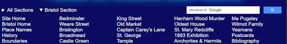
The Bristol submenu showing as it should
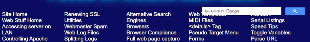
The Web submenu raised by a line height (1.2em)
The submenus affected like this are Bizarre Postcards, Postcards, and Web.
Not showing the effect are the Bristol, Computers, 1913 Flood, Google Charts, House, Navy Days, Optical Illusions, and Utilities submenus.
Until I find what is causing this and find a solution, one workaround is where the Bizarre Postcards, Postcards, and Web sunmenus are used is to add the line
<style>#menuitem2 .submenu {top: 1.2em;}</style>
just before where their details tag is defined and added to the page.
Google Search Bar
As the details tag menu items have been taken out of the normal flow of the page and given a width of 100%, the Google Search Bar was no longer reachable. Changing the z-index of the elements in the nav tag did not help, so I countered this by giving it the CSS position: absolute; and then right:0; The Google Search Bar now works again.
The Code
HTML
The HTML for the new main navigation bar is:
<nav>
<details class="mainmenu" id="menuitem1" name="mainmenu">
	<summary>All Sections</summary>
	<div class="submenu"><!--#include virtual="/inc/main_menu.htm" --></div>
</details>
<details class="mainmenu" id="menuitem2" name="mainmenu">
	<summary>Web Section</summary>
	<div class="submenu"><!--#include virtual="/web/inc/web_menu.htm" --></div>
</details>
<search><!--#include virtual="common/google-search.htm" --></search>
</nav>
CSS
The CSS for the new main navigation bar is:
nav {
	width: 100%;
	height: 1.5em;
	background-color: #0B0B61;
	color: white;
	font-family: Arial, Helvetica, sans-serif;
	font-size: 1.2em;
	position: relative;
	padding-bottom: 0.2em;
}

.mainmenu {
	display:inline-block;
	position: absolute;
	width: 100%;
	padding-top: 0.2em;
}

.mainmenu summary {
	cursor: pointer;
	width: fit-content;
	padding 0 0.5em;
}

#menuitem1:hover, #menuitem2:hover { color: cyan; }

.mainmenu summary:hover, .submenu a:hover { color: cyan; }

.submenu {
	position: relative;
	display: block;
	cursor: pointer;
	background-color: #0B0B61;
}

#menuitem1 { left: .5em; }

#menuitem1 .submenu { left: -0.5em; }

#menuitem2 { left: 8em; }

#menuitem2 .submenu { left: -8em; }

.submenu a:hover, .submenu a:focus { color: cyan; }

.submenu ul {
	column-count: 5;
	padding: 0.5em;
	margin-top: -20px;
}

.submenu li {
	list-style-type: none;
	display:block;
}

.submenu a {
	color: white;
	text-decoration: none;
}

search {
	position: absolute;
	right: 0;
	max-width:33%;
	padding: 0 20px 0 0;
	margin: 0;
}

/* Restyle the Google search box */
.cse .gsc-control-cse, .gsc-control-cse {
    padding:0 !important;
	border-width:0 !important;
	margin: 0 !important;
	background-color:transparent !important;
}

@media screen and (max-width : 1110px) { .submenu ul {column-count: 4;} }

@media screen and (max-width : 890px) { .submenu ul {column-count: 3;} }

@media screen and (max-width : 680px) { .submenu ul {column-count: 2;} }
Sources and Resources
<details>: The Details disclosure element - MDN Web Docs
Automatically close all the other <details> tags after opening a specific <details> tag - Stack Overflow
Can I use details - Browser support for details & summary elements
CSS Selector Reference - W3Schools
Exclusive accordions using the HTML details element - MDN Docs
Focusable Elements - Browser Compatibility Table - A nice table showing which HTML elements are focusable and tabbable
HTML <details> Tag - W3Schools
The details and summary elements, again - Interesting article by Scott O'Hara discussing the accessibility of the details tag
The Details Element - W3C Working Draft
Using <details> for Menus and Dialogs is an Interesting Idea - CSS Tricks
UTF-8 Geometric Shapes - W3Schools