
HomePage | Optical Illusions | War Stories | QBasic | Dads Navy Days | Bristol | Bristol, USA | Bristol, Canada | Terre Haute | Miscellany | Web Stuff | About Ray | Site Map | Site Search | Messages | Credits | Links | Web Rings
Web Stuff | Audio | Basics | Browser | Code Tips | Design | Fonts | Forms | Frames (Page 1), (Page 2) | Images (Page 1), (Page 2) | Links | Random | Redirection | Sound | Video | Search Engines | Lycos UK | Home Server (Page 1), (Page 2), (Page 3)
Ray's Distraction
What a real website should look like
There are many websites around that have a lot to say about website design. Personally, I think your website is exactly that - yours. So long as you think it looks good, then it IS good. But, there are some things that are really going to tick off your visitors. The following is a mixture of bad site and bad coding design that is very common on the Internet, but has no business being there.
Backgrounds
Ever noticed how flashing lights always catches your attention. Well, on web pages the same thing applies. A good flashing background is a brilliant way of attracting people to your site. Your visitors may start to feel sick and may never want to visit it again, but hey, that's their problem.
Images
You can never have too many images on a page. It doesn't matter how big they are and how long they take to download, or even if they are completely irrelevant. Some text books say that a web page should load in about 8 seconds. They are WRONG. The longer a page takes to download the longer your visitors have to take a much needed break. So make those images huge and give your visitors a chance to make a nice cup of tea. If you've really big images they could even go out for a meal or visit friends. The more pointless a picture the better it is. Got a picture of you with your Aunt Mabel? Your cute pet gerbil? Stick them on a webpage. Your visitors will have hours of endless fun wondering if it was worth the five minute wait for it to load. Can't be fussed to check if the image actually exists or the code to it actually works? No problem, even more fun for your visitors as they are left trying to work out what they were supposed to see. If a picture is worth a thousand words then the following images must be worth millions. They certainly say a lot about the person who coded the site.


Some house, somewhere
Text
Have you ever seen this ...?
Aoccdrnig to a rscheearch at an Elingsh uinervtisy, it deosn't mttaer in waht oredr the ltteers in a wrod are, the olny iprmoatnt tihng is taht frist and lsat ltteer is at the rghit pclae. The rset can be a toatl mses and you c an sitll raed it wouthit porbelm. Tihs is bcuseae we do not raed ervey lteter by it slef but the wrod as a wlohe.
This is irrefutable scientific proof that spell checks are for wimps. Now when someone points out a silly grammatical or spelling error on your pages you can just email them back and tell them to get stuffed.
Can't think of anything interesting to write about? No problem, start a BLOG. Now you can tell the whole world what you think about the price of cheese or whatever comes into your mind while you're writing.
Never went to school and just hung around with the boyz from the 'hood? Hot diggetty, don' let that dis u, m8. Ya know wuz good fur u is good nuff for y'll peeps out there. Just strutt ur stuff an let it all hang out, man. Hop Hip rulez OK. It's street cred that counts, so what if people over 25 don't understand a word you're on about and think you're an uneducated moron?
If you're going to write a factual page, then it's no good writing something like "every year in the US, 21,000 people die due to accidents while eating tuna fish sandwiches." Where did you get that fact? You didn't just copy it from another site did you? Some sites deal with the unexplained and unexplainable, but at least some of these have some sort of logic to them. If you want to produce a spoof online magazine with articles like "London double-decker bus found on moon", "Titanic survivor found alive in hull after being submerged for 97 years", "My sister shot JFK" or "Actor becomes President" then you probably won't have any sources to quote. By the way, the last is a spoof of a spoof, an actor DID become President of the United States. Some say it was really his wife running the country, but I'll not say more about that. Sometimes things can get a little blurred, it's up to you to ensure there is no misunderstanding. When I first saw the site Bonsai Kitten I was incensed and very nearly sent them a very nasty email and reported them to the RSPCA and ASPCA. But a couple of experiments on my own cats (now sadly deceased) proved that the site was really a spoof.
Code
The best thing you can possibly do is to fill your site with all the scripting you can. Hey, if someone wanted to read the messages in the status bar you've just filled up with scrolling text that's their problem. You don't even have to learn a language and code your own mistakes, just copy and paste any old rubbish from the web, with a bit of luck it may even work.
To create an impression on your visitors, you don't even need complex languages. You can achieve the same affect in good old HTML. <p align="left"><font size="4" color="#0000FF">See what I mean?</font></p>
Frames
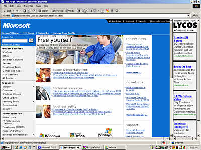
Want to use frames but don't know how to code them properly? Think of all the fun your visitors will have as they try to navigate round your site when the address bar shows the wrong frame set, and the browser navigation buttons get all screwed up because you don't know what you're doing. Why let them off the hook when they decide to leave your site? Just open the next site they visit in one of your frames. Your site will certainly be remembered long after they've left.

This is Microsoft's site stuck in a frame from someone else's site
Links
Another fun filled activity for all your visitors. All because your link say's it's going to take them to a site that's of equal or even higher quality (if that's possible) as your site, that doesn't mean that's where they are going when they click the link does it? The link may say "get the latest news from Microsoft" or whatever, but I'm sure sexslaves4u.com or toesuckersunited.org could do with the extra business. With a bit of luck you could even get the $0.0003 per click-through they promised you. I hope neither of those latter sites exist, they didn't when I wrote this but you never can tell.
But why bother sending your visitors to a site that even exists? Many of your visitors would much rather see the famous

message than anything remotely useful or interesting.
All because you've got a link to another page on your site doesn't mean you actually have to write it. You can take the opportunity to pretend that building websites is very strenuous manual labour and have one of those hilarious "under construction" images on it. In fact, if these images aren't used then several hundred graphic designers could be thrown out of work and YOU would be personally responsible for making their entire families destitute. Google lists 5,200,000 sites that contain the phrase "under construction", you too could be one of the herd.


See ...
http://www.cs.utah.edu/~gk/atwork/ for someone else's view on this particular subject.
http://www.acme.com/jef/construction/ for under construction icons
http://www.best-web-design.org/ - mmmmm - best web design - I don't think so.
Ideas
Can't think of an idea for your site design? Why not do it the easy way and pinch someone else's? Hundred's of people have done it and found themselves on http://www.pirated-sites.com/ - with very little effort so could you! If you're really bored why not just copy someone else's material wholesale. It may be a pretty common, work-a-day type of experience for the lawyers at Microsoft but for you, being dragged through the courts and possibly bankrupted through fines and lawyer fees or thrown into prison with the likes of Bubba could give you a whole new outlook on life.
Site Navigation
It's always a good idea to let someone navigate around your site. You never know, they might find something they are really interested in. Apart from having links and code that don't work properly, why not make the navigation round your site totally obscure? You can sit back and smile smugly to yourself imagining the frustration of your visitors as they try and navigate through your site using the weird symbology you've invented.
See ...
http://www.epidex.com/ - this is a real site - honestly. Just try clicking on one of the menu links.
http://www.zaalberg.freeserve.co.uk/sitemap.htm - I like Chris's site but getting around it is a nightmare. He uses the Tree of Life - but I think it's more like the Shrub of Nonsense
http://www.kfki.hu/~nyikos/ - Another good site but what does the navigation mean?
Making Money
Want to make money from your site? You too can be a millionaire in about 8 or 9 decades, which means you'll be very rich but too senile to know it. You can achieve this by including some advertising on your site. Don't know what products and services to advertise, then try them all! Not only that, but try and get your visitors attention by using pop-ups, pop-unders, banners, links that take you to other advertisers sites - if it's good enough for the porn industry it's good enough for you!
http://www.arngren.net/ - wow, look at all that advertising - very classy!
Cross browser / platform / screen compatibility
What the hell is that you may be asking yourself. If you don't understand it then simply don't bother about it. Everyone uses Windows and Internet Explorer apart from a few weirdo's who use Macs or Linux with Mozilla, Netscape or Opera. If a screen resolution of 640 x 480 is good enough for you then who cares if your visitor's use nice 1024 x 768 screens or perhaps, unlike you, they actually know how to set their screen resolution? Give them a real workout, not only do they have to scroll up and down but sideways too!
... Finally
Once you get the hang of it you'll soon be producing a website that nobody wants to visit and if someone does accidentally stumble into it won't be visiting again.
See ...
http://www.geocities.com/webtekrocks/ - this really is one of personal favourites
Web Stuff | Audio | Basics | Browser | Code Tips | Design | Fonts | Forms | Frames (Page 1), (Page 2) | Images (Page 1), (Page 2) | Links | Random | Redirection | Sound | Video | Search Engines | Lycos UK | Home Server (Page 1), (Page 2), (Page 3)
HomePage | Optical Illusions | War Stories | QBasic | Dads Navy Days | Bristol | Bristol, USA | Bristol, Canada | Terre Haute | Miscellany | Web Stuff | About Ray | Site Map | Site Search | Messages | Credits | Links | Web Rings
This page created 2nd February 2004, last modified 28th December 2004