Introduction
Image maps were introduced in HTML 3.2 which was released in May 1996. They allow user interaction with an image by mapping a set of coordinates to an image. These areas can be defined as a rectangle, circle, or irregularly shaped polygon.
What started me thinking about image maps was a question on Reddit, How do I make a button look like its part of a image
As usual, technology advances and there are various methods of producing the same thing. This page takes a look at some of them.
The information on this page has been tested using Chrome (135.0.7049.41), Edge (134.0.3124.93), Firefox (137.0), and Opera (117.0.5408.163).
Contents: Responsive Image Maps | SVG Images | CSS Grid
Simple image Maps
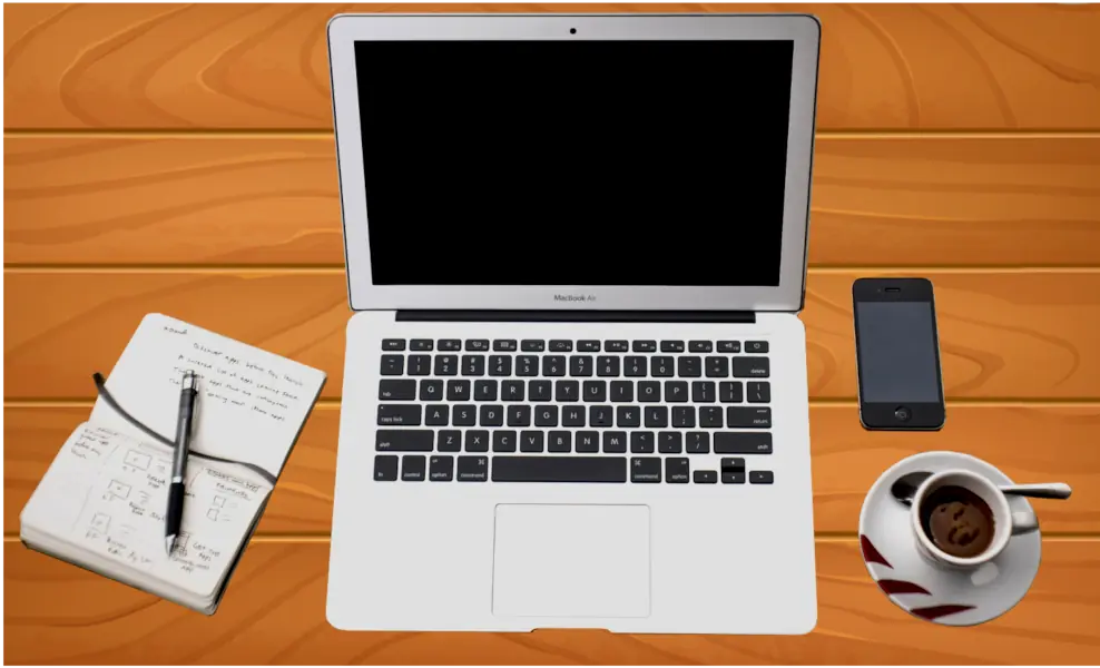
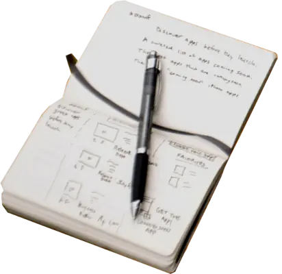
Here is a simple image map. Click on any of the objects to be taken to a webpage.
The above image map works great, on my laptop at least, but on smaller screens because the image is responsive and shrinks to fit the screen and the coordinates are in pixels, the coordinates no longer relate to the display size of the image.
The entire code for the above image map is:
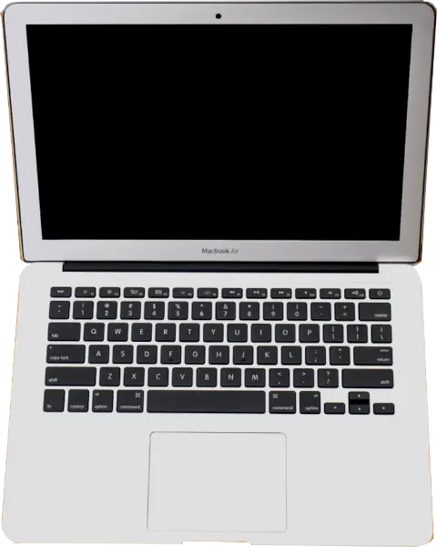
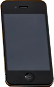
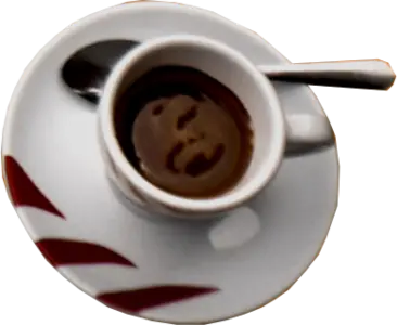
<img class="lrg-img-ctr" src="images/desktop-web600.webp" usemap="#basic" width="988" height="600" alt="desktop image map">

<map name="basic">
	<area class="areapoint" shape="poly" coords="141, 282, 293, 334, 294, 342, 189, 552, 25, 493, 20, 485, 20, 459, 16, 464, 73, 380, 79, 380, 90, 354, 131, 282" alt="notepad" href="https://en.wikipedia.org/wiki/Notebook" target="_blank" rel="noopener noreferrer">
	<area class="areapoint" shape="poly" coords="305, 13, 728, 13, 738, 26, 719, 282, 734, 555, 723, 569, 567, 565, 292, 554, 313, 281, 294, 23" alt="laptop" href="https://en.wikipedia.org/wiki/Laptop" target="_blank" rel="noopener noreferrer">
	<area class="areapoint" shape="poly" coords="766, 250, 836, 250, 850, 384, 773, 386" alt="phone" href="https://en.wikipedia.org/wiki/Telephone" target="_blank" rel="noopener noreferrer">
	<area class="areapoint" shape="poly" coords="920, 446, 933, 476, 921, 532, 860, 562, 781, 532, 773, 481, 787, 432, 849, 405, 912, 435, 957, 434, 963, 440, 958, 448" alt="cup" href="https://en.wikipedia.org/wiki/Coffee" target="_blank" rel="noopener noreferrer">
</map>
So what are the alternatives? One method would be to make the image smaller and map the coordinates to that. My site can be seen on smart phones, so the image would have to be tiny.
Responsive image Maps
Luckily, several people have written JavaScript or JavaScript framwork based utilities to make image maps responsive. How they work is by taking the coordinate points and where they appear on the original image. They then calculate the point coordinates on the resized image.
1) jQuery-rwdImageMaps
jQuery-rwdImageMaps was written by Matt Stow and here is his demo of it. It requires the JQuery library but works well. Here is my demo of it.
Several years ago I was asked to create some interactive floor plans on a site that used a Content Management System (CMS). The CMS was pretty restrictive so I had to look for a method that could be accessed through a Content Delivery Network (CDN). The files are available on several CDNs so I used it to produce this.
2) vanilla-rwdImageMaps
vanilla-rwdImageMaps was written by Luca Kiebel and it is a vanilla JavaScript version of Matt Stow's JQuery jQuery-rwdImageMaps. Here is my demo of it.
3) image-map
image-map was written by Travis Clarke. Different versions are available for use with or without JQuery. I decided to go with the vanilla JavaScript version and here is my demo of it.
Image Map Generators
Most of the image map generators I found can only use rectangles as hotspots, but one, Responsive Image Map Creator, stood out from the others. At first I thought it was not going to work as I use webp images on the site which the generator will not accept. What I did was create a jpg file from the webp image and use that in the genrator then once the code was produced, changed it to the webp file.
I have already got the <map> code so uploaded that to the site, clicked OK, then clickd on the "to html" button. The program is essy to use, has planty of help, and the resulting code is easily edited.
The JQuery code is linked to ajax.googleapis.com but as I already had a minified JQuery file, I changed the code to use that. It also uses imageMapResizer.min.js which is available from their site.
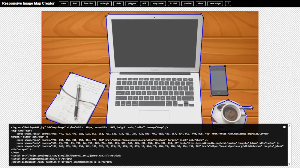
Responsive Image Map Creator editing page
Here is my demo of it.
There are several good static image generators around. These do not supply the code to make it responsive, but that can be done later. Among the good ones are the ones at fla-shop.com, and image-map.net.
Percentages
Rather than messing around with coordinates and the calculations for when the image size changes, why can't percentages be used? The answer is simple - it doesn't work! John Urban wrote Dynamically Rescaling an Image Map (Internet Archive) to see what browsers would do if percentages were used. The code does not work on any of the browsers I tried it with.
SVG Image Maps
The SVG format and Inkscape program are meant for vector images, but I want to use them to show any image can be used in them and have links added to them.
Inkscape cannot use webp files which I use for the majority of the pages, so I created a png file and imported that into the program.
SVG files can have links added to any of its objects, and in Inkscape this can be done by right clicking on them and choosing Create Link from the menu. I tried using separate bitmaps taken from the original image but the problem with doing this is that they are rectangular and so the links are applied to the entire image area. The resulting file was 1.13Mb, a bit big for the web.
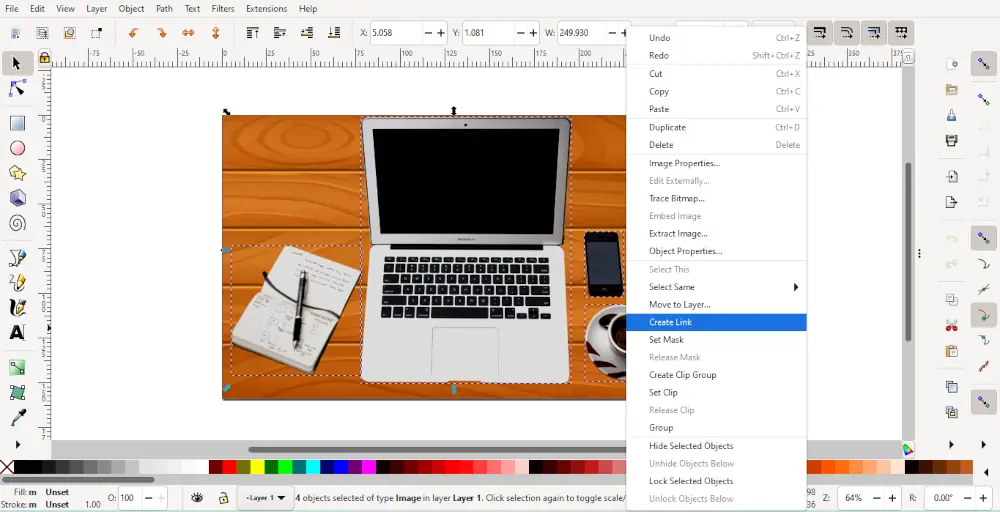
Linking bitmaps in Inkscape. The links are applied to the dotted areas, not just the image part of the bitmap
Using the png image, and using Inkscape's Bezier Curve and Straight Line tool, draw around the various images. Set the fill colour to anything you like. Right click on the shape that was just made and choose Create Link from the menu. The shape needs to be filled for the link to work, but the shape's alpha channel can be set to transparent by going to Filters > Fill and Transparency > Channel Transparency... and moving the Alpha slider all the way to the left.
The finished svg is a little more manageable 588kb.
To put the finished svg file on the page, it must be used with the <object> tag. If used with the <img> tag, the links no longer work. I added the style max-width: 100% to make it responsive. The code to add the svg file now looks like this:
<object data="images/desktop-600.svg" style="max-width: 100%;"></object>
Of course the file would be much smaller if bitmaps were not used, but I wanted to show how the technique could be used for any image.
The finished SVG file
CSS Grid
It seems I got lucky when I chose the image I did for these demonstrations as none of the elements in the image overlap. Let's start by seeing how the elements fit into a grid. It seems that using a 7 x 3 grid, is roughly right, just resizing and moving the elements of the image slightly should work properly.
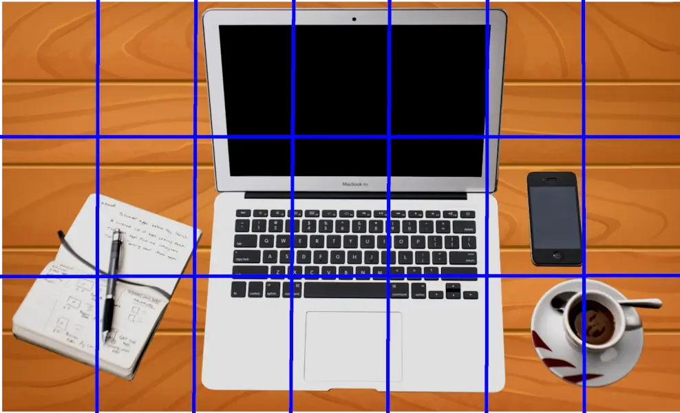
A 7 x 3 grid on the image
When using this methos it is important to remember to use proportional positioning, using fixed (eg px) can cause problems.
The HTML for producing this is:
<div class="gparent">
	<div class="gnotepad"><a href="https://en.wikipedia.org/wiki/Notebook" target="_blank"><img src="images/notepad-web400.webp"></a></div>
	<div class="glaptop"><a href="https://en.wikipedia.org/wiki/Laptop" target="_blank"><img src="images/laptop-web600.webp"></a></div>
	<div class="gphone"><a href="https://en.wikipedia.org/wiki/Telephone" target="_blank"><img src="images/phone-web300.webp"></a></div>
	<div class="gcoffee"><a href="https://en.wikipedia.org/wiki/Coffee" target="_blank"><img src="images/coffee-web300.webp"></a></div>
</div>
and the CSS is:
<style>
	.gparent {
		display: grid;
		grid-template-columns: repeat(7, 1fr);
		grid-template-rows: repeat(3, 1fr);
		background-image: url("images/wood-web600.webp");
		padding-top: 1%;
		padding-bottom: 1%;
		width: 100%;
		height: auto;
	}
	.gnotepad {
		grid-area: 2 / 1 / 4 / 3;
		padding-top: 20%;
	}
	.gnotepad img { float:right; }
	.laptop { grid-area: 1 / 3 / 4 / 6; }
	.gnotepad img {
		width: 98%;
		float:right;
	}
	.glaptop { grid-area: 1 / 3 / 4 / 6; }
	.glaptop img { width: 100%; }
	.gphone { grid-area: 2 / 6 / 3 / 7; }
	.gphone img {
		width: 70%;
		float: right;
	}
	.gcoffee { grid-area: 3 / 6 / 4 / 8; }
	.gcoffee img {
		width: 70%;
		display: block;
		margin: auto;
	}
</style>
Sources & Resources
<area>: The Image Map Area element - MDN Web Docs
<map>: The Image Map element - MDN Web Docs
CSS Grid Layout - MDN Web Docs
CSS Grid Layout Guide - CSS Tricks
CSS Grid Layout Module - W3Schools
GIMP
HTML Image Maps - W3Schools
Image map - Wikipedia
image-map (Travis Clarke)
Inkscape
jQuery RWD Image Maps - Github (Matt Stow)
jQuery RWD Image Maps Demo - Matt Stow
jQuery RWD Image Maps - An old live site - Internet Archive
Responsive Image Map Creator - An online image map creator
Vanilla RWD Image Maps - GitHub (Luca Kiebel)